Paul Goldberger vs. Keith Pleas
Seymour Hersh's The Gray Zone was this week's blockbuster New Yorker article. Hardly anybody commented on Paul Goldberger's High-Tech Bibliophilia, a review of Seattle's new library. I wouldn't either, were it not for the contrast with an earlier review entitled Brutal Architecture and written by Keith Pleas, a software architect, author, and trainer who now works in the area of patterns and practices at Microsoft.
The contrast between the two reviews could not be more striking. The Goldberger piece, which opens onto a two-page spread dominated by a huge photo of the library's angular exterior shell, is full of the kinds of airy proclamations that art and architecture critics love to make:
...the most important new library to be built in a generation, and the most exhilarating...
...not so much a rejection of traditional monumentality as a reinterpretation of it...
...a reinvention of the idea of the public library...
But there are no interior photos, and we learn nothing about how users interact with this "ennobling public space."
Keith Pleas decided to find out for himself. Armed with his digital camera and a deep understanding of how architecture (in the software realm) can fail the test of use, he investigated the library from the inside out. Pleas conducted his tour last month, before the Goldberger review appeared, but he deconstructs an earlier Seattle Times magazine cover story with devastating effect:
On page 25 of the magazine we see a picture of Koolhaas, Ramus, and good old Paul Maritz(!) standing on a tiny balcony:

(Seattle Times photo)
What you can't see in the electronic version of the
image is that the architect and designer are holding onto the thin
metal railing at waist height. Ramus, who knows more about how the
building is actually put together, is holding on with both
hands. Maritz, who's probably the smartest of the three, is standing
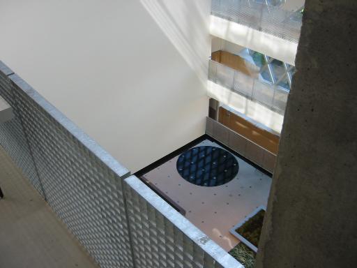
further back. And why are they holding on? Well, here's the view down from where that picture was taken:

You can see the same waist-high railing on this, a main
passageway. You can also just see an edge of a substantial industrial
table placed against the railing. And if you have any imagination at
all, you can see how things placed on this table - which seems to just
be begging to be climbed on - will have full opportunity to demonstrate
their glide characteristics as they descend 6 stories (I forget, but I
think that's the number) to the busy floor below.
...
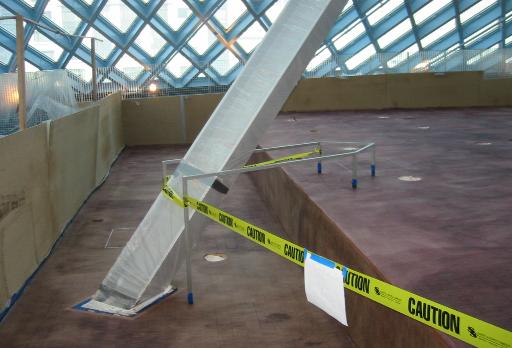
Of course, the architects / designers didn't completely ignore
"life safety" issues in designing the new library. In fact, here's
an...innovative...solution to the double-issue of both tripping and konking your head on an angled support while you're exploring the "unity of knowledge":

[Keith Pleas: Brutal Architecture]
Bravo, Keith! The New Yorker and its readers don't know it yet, but architecture criticism is (or should be) forever changed by what you've done here. And those of us who care about the architecture of software should be heartened to see the instinctive concern for user experience that motivates your analysis.
Former URL: http://weblog.infoworld.com/udell/2004/05/20.html#a1005


