Scalable vector graphics and animation are two of the hallmark features of Macromedia's nearly ubiquitous multimedia player. Yet the company has done a poor job of creating -- or convincing third-party developers to create -- components that make it routine for people to work with spatial and temporal data. And in the recent push to legitimize Flash as a rich-client platform, the company has de-emphasized what is at the core of every Flash movie: its timeline.
It's a hard sell, admittedly. Microsoft is also having a tough time articulating the business case for the scalable vector graphics, 3-D, and animation capabilities it's building into Avalon, the next-generation Windows graphics subsystem. My advice? Stop worshipping the raw power of next year's graphics processing unit, and start showing developers concrete ways to help users deal with their four-dimensional data. [Full story at InfoWorld.com]
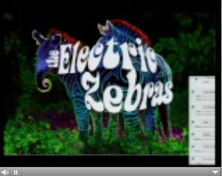
I hadn't yet seen Steve Jobs' WWDC keynote when I wrote this column. The demos, collectively, add up to a pretty convincing shot across Longhorn's bow. But I'd level the same criticisms at Apple's use of its hot new graphics technologies. Here Phil Schiller applies a bump distortion to an image of a tiger, and here he creates the Electric Zebras album cover. Later, Jobs casually shows off liquid distortion as he drags Dashboard widgets onto the desktop. Absolutely luscious eye candy. But, to what end?
We live in an age of innumeracy. The "chartoon" style of graphics that Nigel Holmes invented at Time has now, to my dismay, begun to cheapen the editorial page of the New York Times. Holmes' arch-nemesis Edward Tufte, whom Salon aptly describes as a data artist, sets the bar for precise, intelligent, meaningful visualization of data. We don't get nearly enough of that, and it's not for lack of GPU horsepower or elegant APIs. The gating factor is that you can't bottle and sell the Tuftean sensibility. Still, we can try. I'd like to see Apple or Macromedia or Microsoft put Tufte (or someone who thinks like him) in charge of a Manhattan program to produce a new breed of display widgets and data-wrangling wizards.
I was recently shown a stunning visualization of sales data based on the open source Java Treemap Viewer (background). Like the DateLens viewer I mention in this week's column, the Treemap viewer derives from pioneering work at the University of Maryland's Human-Computer Interaction Lab. I can't show you the actual visualization I saw because it's proprietary, but here's a demo. This technique has been around for years. Of the real-life data sets that could be productively visualized this way, though, I'll wager that few are. I've got a hunch there are a bunch of other techniques that are languishing in research labs too. The industry's challenge is to dig them up, refine them, and deliver them to developers and end users in ways that will really improve our data-driven communication.
Update: Andrew Duncan wrote to remind me that I omitted another WWDC graphics demo: Aran Anderson's stunning Orbit satellite simulator. "If you need a non-trivial justification for all that GPU goodness," he asked, "wouldn't Orbit qualify?" That's a great point, thanks Andrew. An awesome app, indeed. As I mentioned in my column, scientific visualization has always been a voracious consumer of GPU cycles, but it has also tended to live in its own sci-viz ghetto. Now it's time for this stuff to break out into the world of mainstream business data.
Former URL: http://weblog.infoworld.com/udell/2004/06/30.html#a1031