Electoral ebb and flow
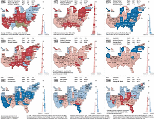
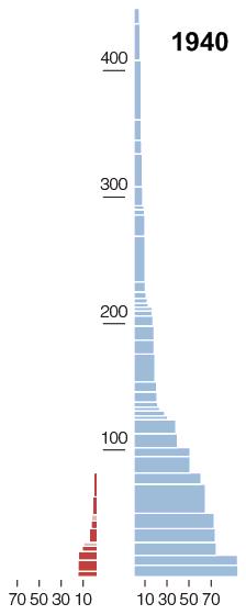 Today's New York Times features a stunning full-page infographic that illustrates the ebb and flow of the electoral college from 1940 to 2000. Edward Tufte would give it an A+, I think, for its use of many of his favorite devices -- notably small multiples, a sequence of similarly-constructed frames. Along with a map in which states are sized according to their numbers of electoral votes, each frame includes a chart where:
Each box represents a state
Color indicates party
Color intensity indicates party change from last election
Height represents number of electoral votes
Width shows margin of victory
Small multiples beg for animation, so I made a one-minute movie of just the charts:
Electoral College 1940-2000: Flash, QuickTime, Windows Media
I hope this will be considered fair use of the Times' content. It helps me to see, more clearly than ever, how unusual 2000 was. And it helps contextualize 2000's virtual twin, 2004.
PS: Here's a partial view of the graphic from which I excerpted these charts. It fills page 96 of today's Times:
Former URL: http://weblog.infoworld.com/udell/2004/11/03.html#a1107
