
We've all seen the hockey-stick curve that shows the blogosphere growing like gangbusters. But I haven't seen much on subscription trends, so I took a look at the public information available in Bloglines. For a given feed you can ask Bloglines to show not just the count of subscribers, but also -- for the "public" subscribers who allow this information to be shown -- their usernames and the dates when they began subscribing.
Bloglines doesn't offer an API for this kind of data mining. So I used a small Python script to fetch subscriber histories for a selection of tech blogs that I read, and render them as XML. From there, I used Excel 2003 to massage the XML data into tables and charts. Here's one view of the results:
And here's another:
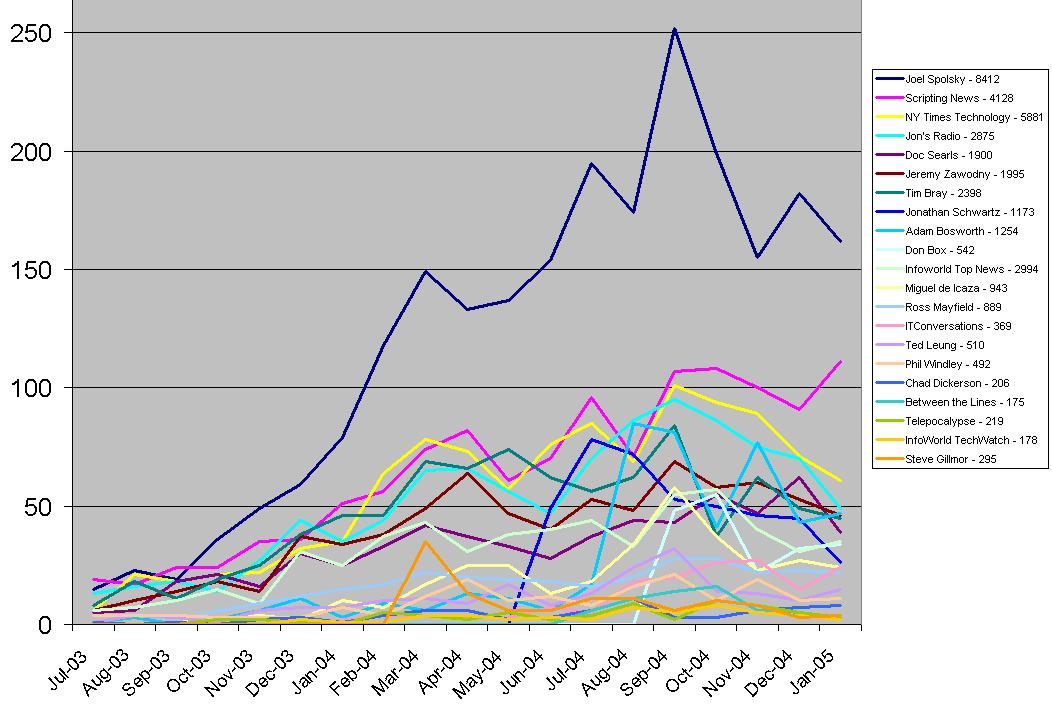
I'm really not sure how to interpret these. The first chart, for example, suggests that while growth is constant -- that is, everyone adds subscribers every month -- the rate of growth varies episodically. It rises steadily through last spring, falls off through June, rises again through September, and falls off again to the present. Is this a Bloglines artifact? How much of this is variation in the rate at which subscribers are switching from other feedreaders, and how much is real growth? Maybe the Feedburner folks can help shed some light on these questions.
In case it's not just an artifact, though, here's something to ponder. The first chart is dominated by the seven blogs that added the most subs in December, the last month for which there's complete data. But if you look at the remaining fourteen you can see a leveling or slight uptick in January, and that's even without the last week's worth of data. The second chart breaks these individual trends out more clearly. I showed this to Chad Dickerson and he offered a fascinating speculation. Could we be seeing a combination of long tail and power law effects?
Former URL: http://weblog.infoworld.com/udell/2005/01/26.html#a1158