 Responding to this week's column, Glen Vanderburg notes correctly that I should have credited Ben Bederson's pioneering work on fisheye distortion in GUIs. I checked, and Samuel Wan does cite Bederson on his blog. Glenn writes:
 Responding to this week's column, Glen Vanderburg notes correctly that I should have credited Ben Bederson's pioneering work on fisheye distortion in GUIs. I checked, and Samuel Wan does cite Bederson on his blog. Glenn writes:
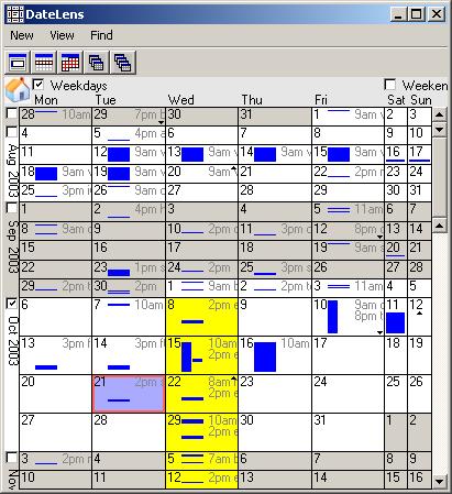
Ben has been working for over ten years now to increase the richness of our GUIs through the use of scale -- in some cases zooming, and in other cases fisheye distortion. Check out the DateLens link on his page, and *be* *sure* to watch the demo video.DateLens It's a whopping 45MB MPEG file, but I did watch it. To come full circle, you can also see a Flash demo of DateLens in action here. Or, as it turns out, you can actually use a free desktop version of DateLens -- there's an add-in (written C# for the 1.1 .NET Framework) available here. I'm trying it out today. It's full of powerful ideas! I love how the grid grows and shrinks to accommodate arbitrary amounts of content, how search results are mapped onto the scroll bar, and how exactly-like and similar items are color-coded with a single click.
The retiling as you zoom in and out is, admittedly, a bit disconcerting. That's partly due to the fact that this version isn't optimized for the desktop -- tooltips don't reveal the next level of detail, and there's no use of the right mouse button which in this case could have been used for zooming out. And partly because this is just a very different way of doing things. Too radical for mainstream use? Perhaps so. I've learned the hard way that UI acceptance is very much driven by expectations, and unexpected behavior tends to be penalized. Several people pointed out to me that there's plenty of UI innovation going on, but in games rather than business software. I suppose that's true. Some changes may require a generational shift.
Former URL: http://weblog.infoworld.com/udell/2003/10/21.html#a829