Scaling the Tufte effect
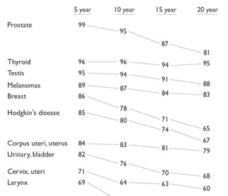
 Reading Edward Tufte's latest opus, Beautiful
Evidence, I stopped on page 176 to consider his redesign of a
table of data about cancer survival rates, shown (in part) here. As
you can see, it's a stack of sparklines, each decorated with data
labels. In Tufte's
online
forum you can find the original table, the redesign, and an
assortment of PowerPoint manglings of the data.
As is often the case when reading Tufte, I asked myself two questions:
- How might this redesign work more interactively on the web?
- How can more people be empowered to do such redesigns, for print
and for the web?
One answer to the first question is this web
interpretation of Tufte's redesign (code). Here I've borrowed part of Joe
Gregorio's sparklines kit and
used it to generate one data graphic (e.g. Prostate.png)
for each disease. I've also
wrapped these images in a linked set of four HTML files, sorted by 5-,
10-, 15-, and 20-year survival rates.

This version sacrifices some of the typographic elegance of the
original in exchange for some of the benefits of the web:
interactivity (you can review different sortings), data availability
(the data are included in the HTML files).
The second question is much, much harder. There's nothing earthshaking
about what I've done here. But most
people won't attempt any data visualization that isn't
supported in the standard chart kits. For starters, there's a
conceptual obstacle. You've
got to have the idea in the first place. I got the idea from Tufte,
but Tufte's brain doesn't scale very well. I can't directly apply
it to novel situations.
Then there's a logistical hurdle. You've got to be able to implement
the idea. In my case, I was able to:
- Understand that I could leverage Joe Gregorio's sparkline kit.
- Acquire the kit, along with its supporting software.
- Learn enough about the kit and its infrastructure to generate
individual data images.
- Combine those data images, using HTML and CSS, to achieve the
effect I wanted.
Of course my brain doesn't scale either. This posting might give you
a useful idea, but you can't apply my brain to your novel situations any
more than I can apply Tufte's to mine.
Can web collaboration address these scaling problems? Maybe. We have
lots of good of ingredients: social networks for images, code, and
documentation. Time to get cooking!
Former URL: http://weblog.infoworld.com/udell/2006/10/30.html#a1554
 Reading Edward Tufte's latest opus, Beautiful
Evidence, I stopped on page 176 to consider his redesign of a
table of data about cancer survival rates, shown (in part) here. As
you can see, it's a stack of sparklines, each decorated with data
labels. In Tufte's
online
forum you can find the original table, the redesign, and an
assortment of PowerPoint manglings of the data.
