Envisioning information
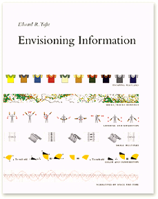
 The title of this entry is also the title of one of my favorite books, Edward Tufte's Envisioning Information. For me, it's a constant reminder of how software should, but mostly doesn't, make information come alive. The other day, Paul Kedrosky put up a Flash visualization and asked:
Why can I not do this sort of dynamic analysis in Excel? Why is Excel stuck analyzing dead, static data? [Infectious Greed: Tiger Woods and Why BI Tools are Awful]
It's a great question. Animation of time-series data ought not be unusual or surprising, we should simply expect it. More generally, our palette of visualization widgetry is depressingly sparse. We can access more and more data, in increasingly useful and malleable forms, but if it all winds up in the same tables and charts, we squander opportunity.
I recently met with a company that's focused entirely on this problem: Visual i|o. You can take a guided tour of their Flash-based decision support toolkit here; at the end of the tour you can remove the training wheels and interact with the full version of the demo.
The first thing to notice is that the tired old pie chart is reborn, in this system, as a dynamic tool that weights, organizes, and measures a set of complex variables. Supporting widgets include time-series analyzers with sliders that do what you'd expect -- and (not seen in the demo) some things you wouldn't, like varying the widgetry used to present supporting data as the time scale changes from days to weeks to months.
The visual richness and complexity of the interface can seem overwhelming. But Tufte's point has always been that our brains are hardwired to process lots of data. We need more information on the page, not less, he argues, because when we encounter densely-packed information -- assuming it's organized properly -- our pattern recognition engines run most efficiently. Of course we're hardwired not just for patterns, but especially for moving patterns. The print medium can't optimize for that feature of the human brain, but software can -- and must.
In a column last year on data visualization, I argued that it's not enough for toolkits -- e.g., Macromedia's Flash, Microsoft's Avalon -- to modernize the chore of graphical programming. We need new languages of visual communication, and new ways to enable both developers and users to speak them. Visual i|o has invented one such language. It would be great if the mainstream toolkits provided some others, and made it easier for all of us to invent new ones.
Former URL: http://weblog.infoworld.com/udell/2005/05/13.html#a1232
 The title of this entry is also the title of one of my favorite books, Edward Tufte's Envisioning Information. For me, it's a constant reminder of how software should, but mostly doesn't, make information come alive. The other day, Paul Kedrosky put up a Flash visualization and asked: