I have trouble with some of the creative aspects of my art business. Not the art itself; there's an ebb and flow to it, but usually I know when my work pleases me and when it doesn't.
But when it comes to developing market materials, all hell breaks loose.
I can't tell what I like anymore.
This month, I've been working with a designer at a local graphics shop, getting a fancy banner for my fair booth. This banner will hang inside my booth at my one big retail show (the League of New Hampshire Craftsmen's Annual Craft Fair) and my one big wholesale show (the Buyers Market of American Craft in Philadelphia).
Here are some of the considerations I have to think about:
It has to look arty, but professional too.
It has to look like the rest of my booth, but it has to stand out.
Should it have elements of my work on it? If so, which ones? Or should my framed posters handle that duty, and the banner should only focus on my name and medium?
But my medium is hard to "get"�it's mostly fiber and polymer clay. Most people see "polymer clay" and think cheap funky jewelry, so I've switched to "mixed media" instead. (As I said in a magazine article once, "mixed media sounds ever so much nicer than 'miscellaneous stuff'....") But mixed media can mean anything from oil and watercolor paints used together, to paper arts, or gourds and beads. So mixed media doesn't explain much.
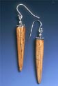
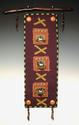
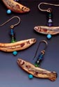
I could say what I make. I make wall hangings, sculpture and jewelry. But that sorta sounds all over the map. When you see my work, and understand the underlying theme that ties it all together, it really is a cohesive body of work. But the words don't look like it.
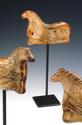
Should I show jewelry? Part of a wall hanging? Should I show the horse artifact I'm becoming famous for? Or will people think I ONLY do horses?
I decide on "Ancient Stories Retold in Modern Artifacts." Sounds beautiful. But what does it MEAN?
And maybe "Artifacts from a lost culture, an imagined prehistory..." is more accurate. But it's even sketchier.
The designer is excited about the assignment. He's an art student at Keene State College, our local liberal arts school, and eager to do some "real world" work to augment his school projects. He comes up with an interesting design, using an image my photographer took a couple of years ago. It's a shot of my worktable. Okay, okay, a very lovely, idealized shot of my worktable. It looks like a small work-in-progress, like I'm working on a small fiber collage, with lots of the artifacts, beads, and buttons I make to embellish them. Steve has taken a "slice" of the shot and inserted my name. He e-mailed me an image of the mock-up for my feedback.
Now comes the fun part. I have no idea if I like it or not.
It's BEAUTIFUL. But is it a working banner design? I have no idea.
So I send the image to about 40 of my peers and cohorts in the biz�other artists, painters, graphic designers, show promoters and a few gallery owners. "Here's my new banner--be brutal!"
And what I get back is guaranteed to make me cry.
"I LOVE it! It's perfect!" "I love it! What's all that stuff in there?" "I love it! Your name is too small! What are those things falling out-of-frame?" "I love it! Your name is WAY too small!" "I hate it! What's all that stuff in there??"
One dear friend sends me a long thoughtful e-mail. Then asks if his opinion is too strong or too soft or just right? He's trying to get better about offering advice, and would like my opinion. I tell him I'm in no mood, as I'm already totally in limbo about the banner. I will give him feedback on his feedback later.
I summarize and temper the comments and reply back to Steve, asking him to move some of the design elements more into the frame, and make my name bigger.
Another round of critique.
"I love it even more! It's perfect!" "I love it even more, but your name is too small!" "It's perfect! Your name is still too small!" "I hate it!" (I drop this person off the list.)
I e-mail Steve and ask him to make my name bigger yet. He obliges. He over-obliges, in fact. In the third version my name is embarrassingly big.
Most of the banner banter agrees, saying a compromise between version two and version three is in order. I e-mail Steve again, and leave it til morning.
Poor Steve! Let's hope he has a sense of humor and the patience of Job. (Although this IS perfect combat training for a designer.)
And let's be thankful I'm not in the graphic design business....