First things first.
Jeff Baird, Brattleboro VT 1-802-258-1328
He's a busy guy, so be forewarned:
Plan ahead. Leave enough time to book him, get the work shot, and get your slides/images back. Sometimes I've been in a pinch and he can work me in--but then, he's been shooting my work for ten years.
If you leave a message, he will only call you back ONCE. In other words, he won't keep calling and calling because he's so desperate for the work. So even if you think it might be HIS turn to call, if you have any doubt and it's been awhile, CALL HIM BACK.
Now for the fun stuff.
A reader asked me to explain the difference between a jury image, a marketing image, a catalog image and an advertising image. Hmmmm....I'll do my best, though I'm no expert.
I'll start with the easist: Jury slides.
These are the images of your work you use to apply to a juried show.
Usually a set of five images, one image per frame, sometimes with one of them being a detail or close-up shot (if necessary to understand your work better.)
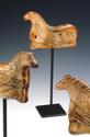
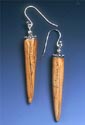
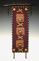
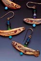
A jury image is, ideally, a very clear, very straightforward shot of ONE ITEM, usually shot on a neutral ground --gradient gray, deep blue or black, whatever the trend is. We've experimented with different backgrounds, but the deep, dark end of gradient grey does seem to work best. If you want to risk a fabric backdrop, NEVER use wrinkled fabric. OY. It just looks awful.
Sometimes it pays to get dramatic, but in general, when a jury is faced with the prospect of looking at several thousand slides, simple is better. One image per shot, clearly portrayed, well-lit, no hot spots, perfect focus, centered and filling as much of the frame as you can.
Images of multiples is usually frowned upon, though sometimes one is acceptable.
A set of jury images should show a cohesive body of work, with a definite style. Everyone argues over what this is, and it's difficult to explain it clearly. But when people look at the series, they should be able to say, "Hey, that's Luann Udell's work!"
If you create different lines (totally different types of work) it gets complicated. I myself have three lines--wall hangings, jewelry, and sculpture. And within my jewelry, I have animal artifacts (horses, bears, fish, birds) and natural objects (stones, shells, bones.)
For some shows, I show a cohesive range of items--Perhaps two wallhangings, a sculpture (referring back to one of the artifacts on a wall hanging) and a sample or two of jewelry (again, referring to the artifacts.) I have different items, but the theme of the animals and the faux ivory unite them.
For some shows, I have to apply in two, or even three different categories--sculpture, fiber/decorative, and jewelry.
On the other hand, this is NOT the time to show them "everything you got." Strategies such as "Hey, look, I can sew a jacket, a doll, a pot holder, a wall hanging and a pillow!" do not work with juries. They want to see focus, theme, coherence, consistency in quality.
If it adds to the line-up, a detail shot can be included (or if the jury requirements ask for one.)
For a complete overview of jury slides, and valuable insight on the jury process, check out Bruce Baker's brand new CD on the topic at http://www.bbakerinc.com/
Catalog Image. It's just what it sounds like--an image of your work you would use for a catalog or sell sheet (a sort of one-page catalog.)
We all know what catalogs look like, right? Are we not shoppers? Think about what you like to know when you are shopping by mail or on-line, and that's what you need for a catalog image.
It can be simple and straight-forward. "This is a picture of a mug. It is brown. It has a handle, and an image of a bird on it. And here's a mug with a bear on it. And wait! Here's another one. This one is brown, too, but it has a kitty! I also make a blue mug with a bird. And a blue mug with a kitty. Here is the brown plate with a bird that goes with brown bird mug. Over here we have brown napkin holders with a bird--but you have to buy a set of four." Etc.
Or it can be schmoozed to within an inch of its life. Think Sundance Catalog. Yummy! A set of four of those bird mugs would be arranged on an antique pine table, next to an old rusted metal candleholder with a sage green candle, with an old serape casually draped diagonally underneath them and an inviting basket of freshly-baked breadsticks nearby. You could almost smell the breadsticks.
You now want to buy the mugs, the table and the serape. Hey, is that candle for sale, too?
In fact, these so-called "environmetal" shots are becoming very popular in many catalog and sales venue (check out The Guild's website http://www.guild.com/ or browse through their sourcebooks, targeting interior decorators, architects and retail buyers.)
Will it work for you, in YOUR catalog? Maybe. But not if your customers are more interested in the tablecloth than your mugs.
Also, your wholesale customers may be more interested in the brown-mug-with-bird and the blue-mug-with-kitty layout. They need to buy two dozen mugs in three colorways, and they prefer kitties to birds. Are matching plates available? How big are they? And what's with the damn candle??!! Environmental photo-schmoozing works best with retail customers.
Marketing Images: These are images you would use in your marketing and publicity efforts. You can use almost any image for publicity, such as a jury image and many people do.
Here's where a little creativity works harder for you. The image can actually be composed to work as an ad or a brochure image ahead of time.
I watched Jeff photograph a friend's beautiful pottery--organic-looking, softly bulged and wavey edged pots, with deep, mysterious interiors. He showed only about a third of one pot, the wavey edge. It was enough to show it was a pot, and to show what was going on with the pot--the style, the color, the texture, etc. But it left room for her name and the name of her company for the front of a brochure.
I saw another potter's work photographed for a brochure cover. On the left was the right side of a tall, colorful pot. In the background was another pot, shorter, rounder. The two were linked in style and color, but the "line" of the foreground pot was also a design element in the shot. You might not normally show such a "half-a-pot" shot for a jury slide.
Jeff shot a necklace for me, for an ad. Again, he left a big open space, enough for me to drop in type later--my name/business name and a tagline ("Ancient stories retold in modern artifacts..." The necklace draped gracefully around the "empty space" left for my text.
But publicity images are even more powerful when they go beyond the "here is my bird mug" stage.
Jump over to the League of NH Craftsmen's website: http://www.nhcrafts.org/ It's subtle, but probably the first images that catch your eye are the images of people making their stuff. In fact, what I call a "working artist" shot can be the most powerful tool in your marketing tool bag. People see this kind of photo on a website or in a brochure or in a newspaper article--and they want to know more. Much, much more than if they just saw a picture of your mug. (Your bird mug, not your face.)
One example is the photo on my main website http://www.luannudell.com/ This was taken by Steve Dunwell of Boston MA. You can see more of Steve's work at his website http://www.backbaypress.com/SD-1.html
This is obviously an image I would never use as a jury slide. It's about ME THE ARTIST, not really about my work. It's not a catalog image--unless you are interested in my jacket.
It's clearly an image that generates interest in my story. It shows a little bit of my work, a lot of me, part of my studio. Your interest is piqued (hopefully) and you'd like to learn more.
One of my favorite marketing images is that same postcard from the ACC show I mentioned in PHOTOGRAPHY REVISITED. It shows the artist, a floor cloth painter, sitting in her booth with her friend and assistant. They are both laughing. She is surrounded by examples of her work--floor cloths in vibrant colors (deep orange, lime and olive green, gold and yellow) hang on the booth walls, and her painted pillows are strewn around the edges of the booth. But what really catches your eye are her boots. She's a tall, slender girl, dressed in an extremely eclectic style. And she's wearing tall laced brown leather boots. And the shoe laces are....bright yellow!
That double row of little yellow X's running up her legs, her bright and colorful work beautifully arrayed in her booth, and her and her friend's obvious delight--it just makes you want to step into her booth and say, "Can I join in the fun?" Perfect postcard image for a retail show.
I saw another great marketing image from my friend Arra David's company, Sea Stones http://www.sea-stones.com/
I met Arra at the Boston Gift Show a few years ago. His company makes functional home accessories from beach stones.
In his brochure was a wonderful photo of a truck loaded with rocks. He told me that several times a year, they buy a truckload of rough rocks from a local quarry. Then they drive them to the ocean, where they "reseed the rock beds."
You can read the story by clicking the "about" button on the Sea Stones home page. Dang! They took out the truck photo. But I think that's Arra throwing a "seed rock" back into the ocean there.
What a hoot! And what a great story! It's just a funny little moment that has gone on to garner a lot of publicity for his company.
And I just realized I've written myself into a corner with the marketing shot vs. the advertising shot. Obviously, sometimes you could use a jury image for advertising, and sometimes the image for a brochure would also work well for an ad.
But usually those human-interest images--the girl with her artsy shoelaces laughing in her booth, the truckload of "seed rocks"--are not what most of us would use for an advertising image. They would be SUPER in a press kit or in a magazine article. But when we advertise, it's usually about our work, our product.
None of this is definitive, and I'm sure I've left out a lot of important stuff. I will remember what that is at 4 a.m. and I assure you I will NOT come down to the studio to put it in.
But I hope I've given you something to think about the next time you send your work out to be photographed.