A question came up on a discussion forum on what the heck you put on postcards. I'm sharing tips I've heard and learned from other people, and ideas I've used myself. Feel free to add your ideas and experiences in the comments section. This is not "The Compleat Guide to Postcards", just ideas and different ways to think about them to get your own thoughts going.
First are the technical considerations. The U.S. Post Office has strict standards in where the address, stamp, barcoding and text goes on the back of a postcard. Most commercial postcard printers know these standards, and you can see examples of them here: http://www.overnightprints.com/main.php?A=USPS&ONPSESS=b6556010e76b306e5ff6c0a8475bb973 or this one: http://www.expresscopy.com/support/postcardspec.phtml or Google "USPS postcard standard" or "USPS postcard regulations" to find more information.
oddly, I found it a little more difficult to actually find this information on the www.usps.com website, but maybe that's just me.
So what about that precious grey area that's available for your actual message? And what the heck goes on the front?
Let's talk about the front of the card today, the image.
First, as always, use the very best photography you can get for this image. DO NOT CUT CORNERS HERE! The first thing the recipient will look at is this image. If the photography is poor--blah lighting, bad focus, low resolution, mediocre color--that will speak volumes about the quality of your work before you even get to say your message.
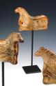
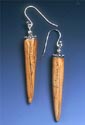
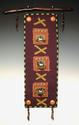
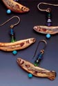
Consider the work itself. If it is not intriguing, interesting, beautiful, fun, compelling, whimisical, dramatic, classy, it will get set aside with the other junk mail. And know if your target audience is looking for intriguing or fun or classy, or whatever. This part is totally YOUR responsibility, of course.
Think about HOW the item is photographed. Bruce Baker says that certain artists tend to get a little OCD about how we display our work. Everything lined up just so, exactly centered in the frame, etc. In a photo, that means work dead-center and straight on, the traditional graduated gray background, maybe lots of space around the item. Typical jury-quality images, so to speak.
That way of showing your artwork has worked for years, and it's not going anywhere anytime soon. It's basic, but it works. The graduated gray background is still industry-standard for showing most work in its best light--no distractions, neutral, etc.
But postcards are NOT jury sessions (although, in a way, your work IS being judged.) It's okay to consider alternative ways of postioning and presenting your work.
For drama and interest, my photographer loves images that are just entering the frame. He loves zooming in on an interesting detail, or shooting an unusual angle, or using focal points to direct the eye. He also likes to use the frame to crop the image, showing a fourth of it, for example. It allows you to get in close to the item and still see enough of it so you can tell what the item IS. Getting away from that full-view, dead-center format can excite the eye and add interest.
Look through magazines and catalogs for ideas. These companies have spent thousands, maybe tens or even hundreds of thousands of dollars, to produce these images. You get to look--and learn--for free! (Okay, maybe not free, but for the cost of the magazine. Unless you go to the library or newstand. Then it's free.)
See how products are presented in the magazine ads, and in product review features. (In women's magazines, this is often called something like "Things We Like".) You don't even have to look at magazines that match or complement your work. Just look at the ads that catch your eye and hold your interest.
In the catalogs, look at how the items are shown, and see what is written about them. (More on this when we get to the BACK of the postcard.) For now, pay attention to how this item is being presented, and marketed.
Environmental shots (your product in use in an actual home, office, etc.) are hot. Just make sure it's crystal clear what item in the shot is YOUR work. For example, you don't need a shot of an entire room to show a painted canvas floor rug in use. Or even a shot of the entire rug. You don't need to show an entire dinner party in progress to show a beautiful bowl or wineglass in situ or in use. You also don't want a beautiful prop upstaging YOUR work. Catalog companies dread the prop that overshadows the product. They know when it happens, because they get swamped with calls asking about the widget in the photo that isn't actually for sale...
Look for jarring juxapositions. One photographer wrote in a column how he was shooting a set of beautiful handmade wineglasses. Some of them got knocked over and broken halfway through the shoot. On a whim, he kept shooting a few more frames, and by accident, he included those images in the packet for the artist. The artist used them--and started getting into his desired shows!
Do I recommend you break some of your pieces and put them on a postcard? Nope. But sometimes that little unexpected detail in an image can grab someone's attention in a way that careful set-ups and controlled layout can't.
On the other hand, don't let your props overwhelm your art! Many times I see images of glass or pottery vases holding flowers, where the flowers are either a) mediocre, looking like someone grabbed a packet of mums from the grocery store, or b) too beautiful, totally overshadowing the vase itself. Even if your message is, "my work is affordable", you DON'T want it to look "cheap".
One idea: A shot where it looks like someone is putting together a floral arrangement and had to leave for a moment. A few beautiful flowers are arranged in the vase--your lovely handmade vase--but there are blooms and tools still on the table. And the beautiful vase, waiting patiently for the person to return. NOW you have a moment in time, and a story. Where did the person go? What will the arrangement look like when it's finished? Wow! What a beautiful vase! (Bruce Baker is big on telling stories with your images.)
Now think of your brand. I won't go into a big brand rant--I'm still figuring out MY brand! But some of the brand stuff is straightforward. Whether your work is whimsical, trendy, classic, you want that flavor to come out in your image. Do you make dog food bowls? How about a dog looking hopefully at one of your bowls?
How many images? One? Two? Cram as many as you can? Alisha Vincent, former acting executive director of the Arts Business Institute, says through informal group exercises, she thought one great image grabbed the most attention. Two was okay. More than that, and the message was muddled. Not to say multiple images don't work--they might be more exciting if multiple artists are doing a group mailing--but they are not as powerful as single images. I think this might be because the minute you look like you are trying for "something for everyone", you dilute your message.
Tomorrow I will talk about the back of the postcard again--the text part! How often should you use postcards? And when? And what do you say on them?